Adaptive Icons That Fit Every Shape, Every Screen
Craft icons that fit any screen and style without losing brand spark. Our android adaptive icons let shape, size, and color adjust in real time, so apps look sharp on all devices.
Legacy
Round
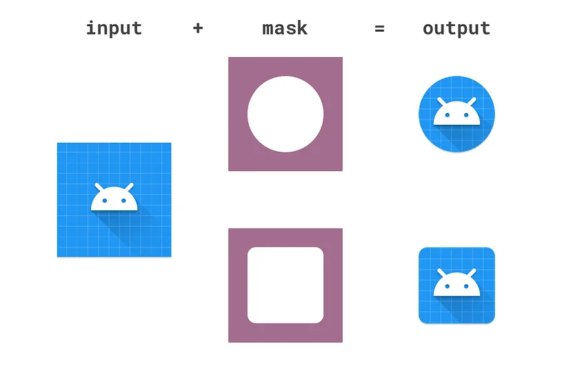
Full Bleed (Foreground)
Drag & drop your image here
orCheap Flights Global
Cheap Flights Global helps you search, compare, and book affordable international flights. Find cheap airline tickets, top flight deals, and the best prices to destinations around the world.
Designing Adaptive Icons
Create perfect icons for Android 8.0+ with our advanced generator
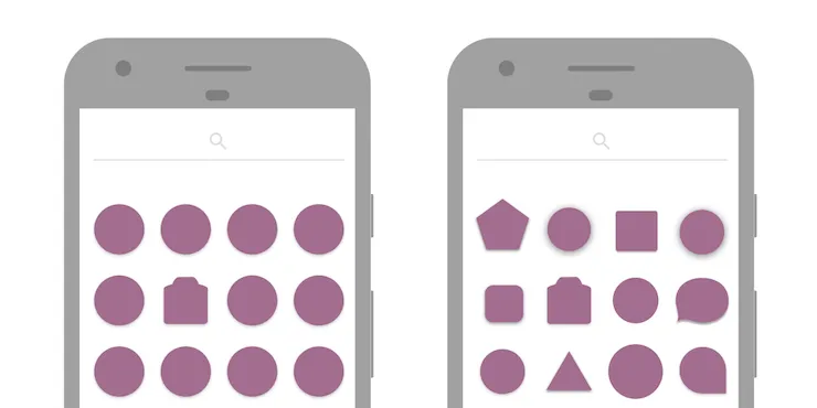
With Android O, Google introduced adaptive icons that unify app icon shapes across devices, offering consistency and opening up new visual effects. Any Android app developer targeting Android 8.0 (API 26) and above can use our app icon generator to create perfect icons. With Android O, Google introduced a standardized approach that our advanced icon generator fully supports.
To understand the evolution of this feature, take a look at where it started.
Initially, each app determined its own icon shape, size, and drop-shadow, leading to inconsistencies. Here's an example from Google's icons in 2012:
Though recent improvements and material guidelines have added consistency, developers still face challenges. Adaptive icons aim to balance developer freedom with a cohesive user experience by defining clear expectations for app icon display. Our professional icon generator solves these challenges automatically.
As a result, custom launchers and icon packs have emerged to standardize icon sizes and shapes. Devices also introduced background overlays for icons to maintain consistency across platforms. Our smart icon generator handles all these variations seamlessly.
Elevate Brand Consistency with Adaptive Icon Frameworks
Every app needs an icon that looks good on any launcher, from square Android masks to round smartwatch badges. With our icon shape adaptability toolkit and powerful app icon generator, you create one design that morphs to all shapes at once.
Avoid extra exports and free up time to refine your art
Keep your team focused on fresh ideas instead of format details
With our automated icon generator, you can plug your icons into the build pipeline in minutes. Add SVG layers, define safe zones, and let SVG icon automation handle the rest.
This move slashes manual updates each time you tweak a shape. Consequently, you speed up releases and keep your team agile in a fast-moving market using our efficient icon generator.
Drive Engagement Through Vibrant, Dynamic Icons
By blending responsive adaptability icon design with a simple setup using our dynamic app icon generator, you cut export steps and deliver polish fast.
"Users form opinions in seconds, so a striking icon grabs attention and boosts tap rates."
With our interactive icon animations and creative icon generator, you set icons to bounce, glow, or change color on touch and surprise users.
Example:
Make your icon fill with brand hues to show new content without a noisy alert.
At the same time, you test icon versions in your staging area using our A/B testing icon generator to compare performance. Data guides you, so each tweak drives real lift instead of guesswork.
By checking metrics before launch, you ensure your icons work hard for every download. Our data-driven icon generator provides the insights you need.
Streamline Your Design Workflow with Smart Icon Tools
Cut out multiple artboards and manual exports by using our one-stop versatile design workflows panel in our comprehensive app icon generator.
Key Benefit:
Tweak size, padding, or shadow depth once, and all icon versions update instantly. This move boosts icon design efficiency and saves hours of repetitive work.
Also, our adaptive icon generator helps your team keep up with updates and stay creative.
Link our advanced icon generator to your CI/CD pipeline to run automatic checks on file size, layer order, and contrast.
This step catches issues early, so you avoid last-minute fixes. Thus, you protect your brand's look and roll out updates with confidence using our reliable icon generator.
Features Of Our Android Adaptive Icons
Professional tools for perfect icon generation
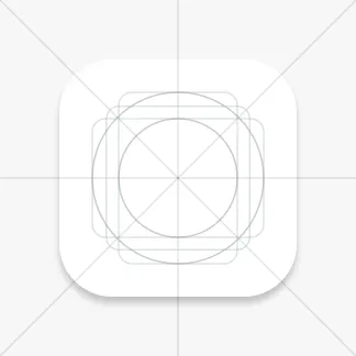
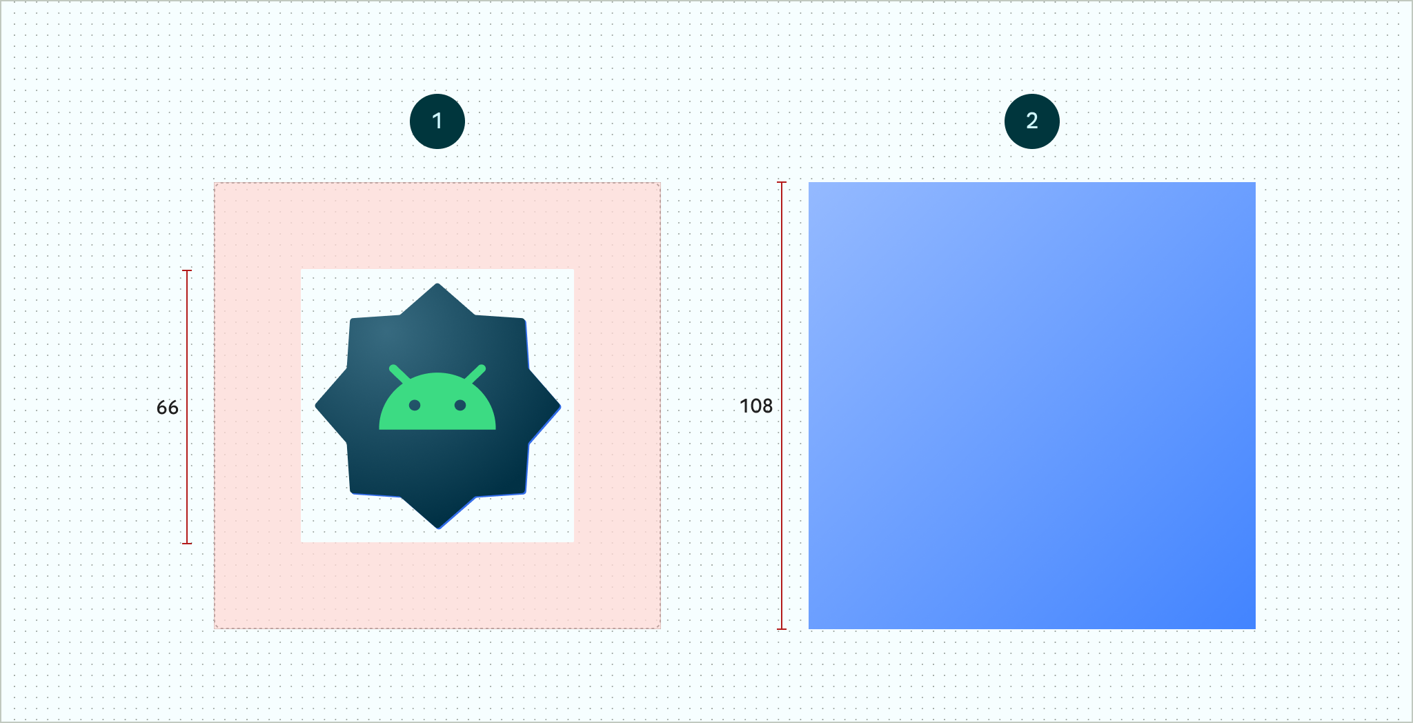
Our adaptation icons are designed to be 108dp by 108dp but are masked to 72dp by 72dp for consistent display. Different device shapes and masks can create variations, so a 66dp diameter circle in the center is considered a safe zone. Our precision app icon generator ensures perfect alignment every time.
Keylines
Keylines ensure visual alignment with common shapes, such as circles, squares, and rectangles, forming the foundation of the icon grid. Reference these keyline shapes:
- Circles: 52dp & 36dp diameter
- Square: 44dp by 44dp with a 4dp corner radius
- Rectangles: 52dp by 36dp and 36dp by 52dp, with a 4dp corner radius
Layers
Our icons consist of a 108dp by 108dp foreground and background layer, with the background being fully opaque. Foreground transparency enables animations and effects, creating a dynamic icon experience. Our layered app icon generator manages all these components seamlessly.
Why Pick Our App Icon Generator
- Icons adjust to every mask and size instantly
- Design once and deploy everywhere
- Quick SVG setup with live previews
- Automate exports and updates seamlessly
- Maintain crisp clarity in light and dark modes
- Delight users with touch-triggered animations
- Support accessibility with motion-free options
- Collaborate in real time in the browser
- Integrate with CI/CD for error-free builds
- Run A/B tests to boost tap rates
- Save hours on repetitive icon tasks
Build Brand-Ready Adaptive Icons in Minutes
Start crafting professional icons today
Ready to reshape your icons and captivate users? Start crafting your android adaptive icons now with our easy-to-use app icon generator!
Our streamlined icon generator makes professional icon creation accessible to everyone, from solo developers to enterprise teams.
Get Started Today
Create your first adaptive icon in under 5 minutes
Design Considerations
Professional tips for perfect adaptive icons
Clipping
Since the mask shape varies, place critical elements within the safe zone and avoid placing important content near mask edges to prevent unwanted clipping. Our smart app icon generator includes safe zone guides to prevent these issues.
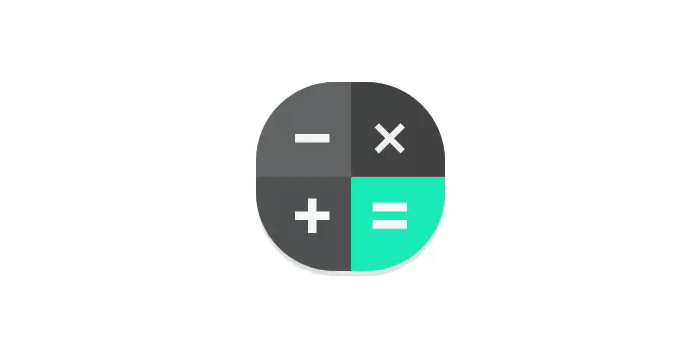
Background Anchoring
Moving background elements independently can create depth. For example, the calculator app anchors the equals button in the background for subtle, layered motion. Our advanced icon generator makes these effects easy to implement.
Masked Masks
Using a solid foreground with cutouts allows backgrounds to shift, revealing different areas. This creates dynamic effects, such as a colorful background peeking through cut-out shapes. Our creative app icon generator excels at these complex designs.
Light & Shadows
Separate shadow layers and lighting effects can create playful depth, though careful planning is necessary to avoid unrealistic interactions. Follow material guidelines for cohesive lighting across icons. Our professional icon generator includes material design presets.
Leave Behind Effects
Elements entirely obscured by the foreground can be revealed during motion, providing a unique visual effect. Our dynamic app icon generator supports these advanced animation techniques.
Adaptive Icons FAQ
Everything you need to know about modern app icons and our icon generator
What are adaptive icons?
Which platforms work with adaptive icons?
Our versatile app icon generator creates icons for Android (API 26+), and you can export them as PNG or SVG for web, iOS, desktop, or any other platform.
What file formats does your icon generator deliver?
- SVG vectors - Scalable for any resolution
- PNGs at all standard Android sizes (48×48 dp through 432×432 px)
- Source files for Figma/Sketch/Illustrator
- All formats generated automatically by our comprehensive app icon generator
What's the optimal icon size for app stores?
Android sizes: 108×108 dp, with safe zone at 66×66 dp.
Our app icon generator automatically creates 1024×1024 px for the App Store as well as all required Android sizes.
How can I disable adaptive icons?
Here are quick ways to turn off these icons on most devices:
- Samsung One UI: Home → Styles & wallpapers → Edit style → Icons → pick a non-adaptive shape.
- Nova Launcher: Settings → Look & feel → Icon style = None (or choose a legacy pack).
- Action Launcher: Settings → Display → turn off "Adaptive icon masks."
- Other launchers: Install Lawnchair, Apex, etc. → apply your icon pack—shapes stay unchanged.
Note: Even if disabled, our app icon generator creates icons that work perfectly in all modes.
How does your icon generator work with Expo?
Simply upload your design to our app icon generator, and we provide all the assets Expo needs. You get a 1024×1024 PNG (with transparency) as your app icon, plus the two-layer (foreground+background) assets and XML so Android launchers can mask, shape, animate, and theme your icon dynamically.
Our Expo-ready icon generator handles all the technical details automatically.
Why should I use an app icon generator instead of designing manually?
Our app icon generator saves you hours of work and ensures technical accuracy:
- Time Efficiency: Generate all required sizes and formats in seconds
- Technical Accuracy: Perfect safe zones, layers, and specifications every time
- Consistency: Maintain brand consistency across all platforms
- Updates: Easily update icons without recreating all assets
- Cost Effective: No need to hire specialized designers for simple updates
- A/B Testing: Quickly generate variations for testing